Bright By Text
Bright by Text
Provides quality information and trusted resources to parents and caregivers of children prenatal to age eight. This is an ongoing project for 2021.

Designed this splashpage to show the 100K accomplishment at Bright by Text
Roles and Responsibilities
-Lead UX Design
-UX Research and prototyping
-Graphic Design
Problem
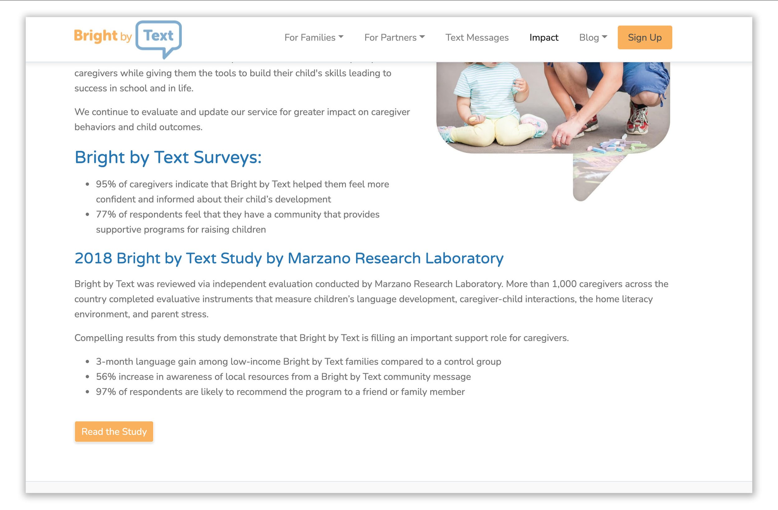
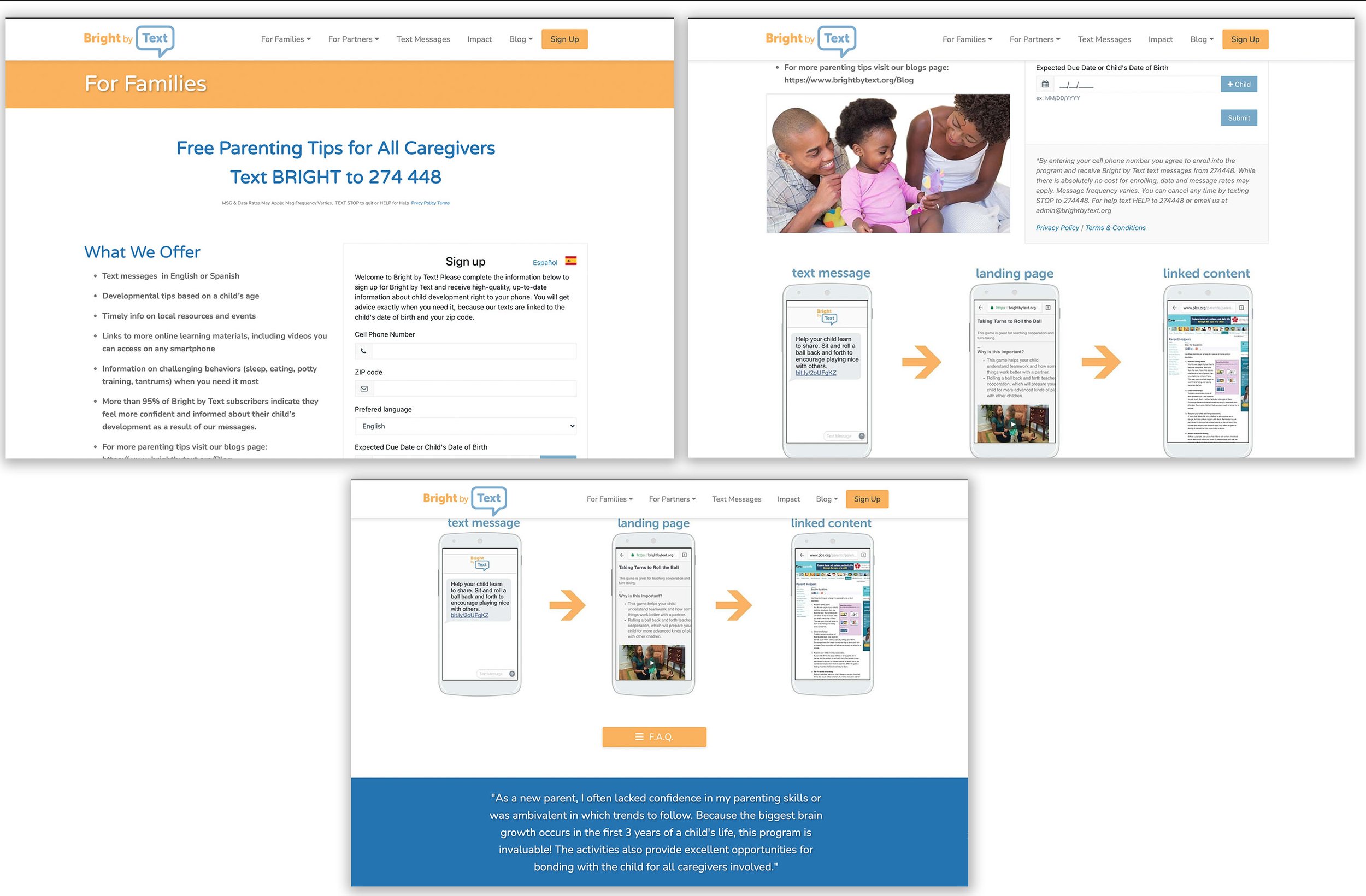
There was a lot text to read. Nothing was organized enough to grasp what the main points were. Customers didn’t engage enough with the Impact page or the Sign Up page.

This is the old impact page before I worked on it.

This is the old sign up page before I worked on it.
Context
A parent wants the very best for their child. They find Bright by Text, and discover the impact page. They are looking for a company they can trust and the impact page provides insight into the company and what values the company has. In order to see this they must read, and get quick points as to what the company has to offer.
Final Designs
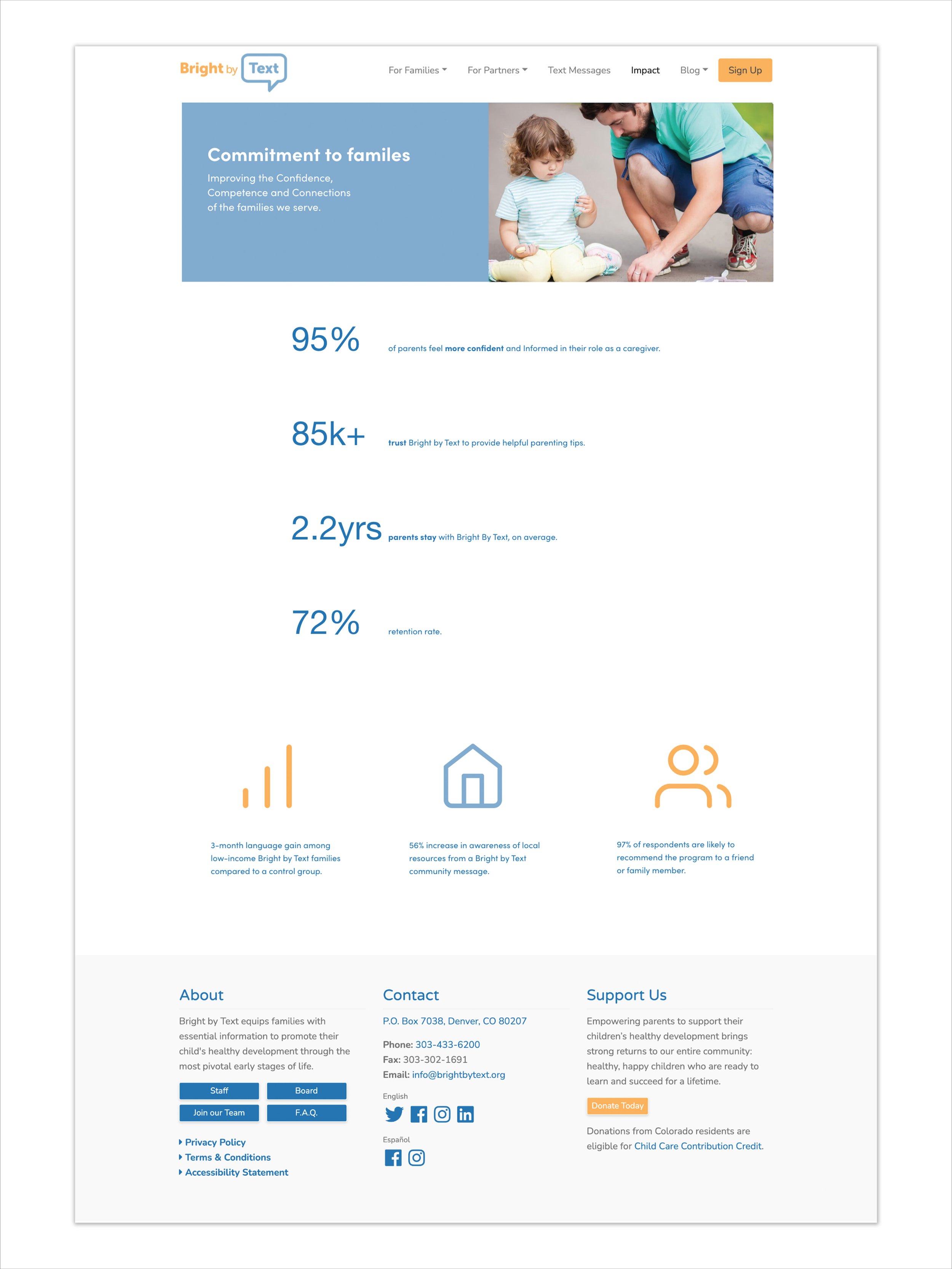
For the Impact page I focused on the main points that the audience needed to read first. I worked with the Chief content officer and growth officer to breakdown the main points that they wanted to user to grasp. I kept the photo, because I wanted to show a parent interacting with their child. I also focused on the analytics, because this is something that was not prominent before, and since this is an impact page, it needs to show positive analytics. White space was also needed so that the audience could read the main points. I also kept it within the branding colors of the company. I used icons to highlight some other sub-points that are important for the users to read as well.

For the Sign Up, the graphic is inclusive of families. The information on the right shows everything that needed for a simple sign up form. If the user has questions, they can find out more from the FAQ page. I kept the design simple, so that the user can focus on signing up.


