Ping
UI/UX mobile app
PING
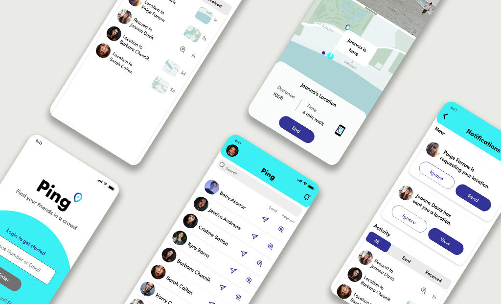
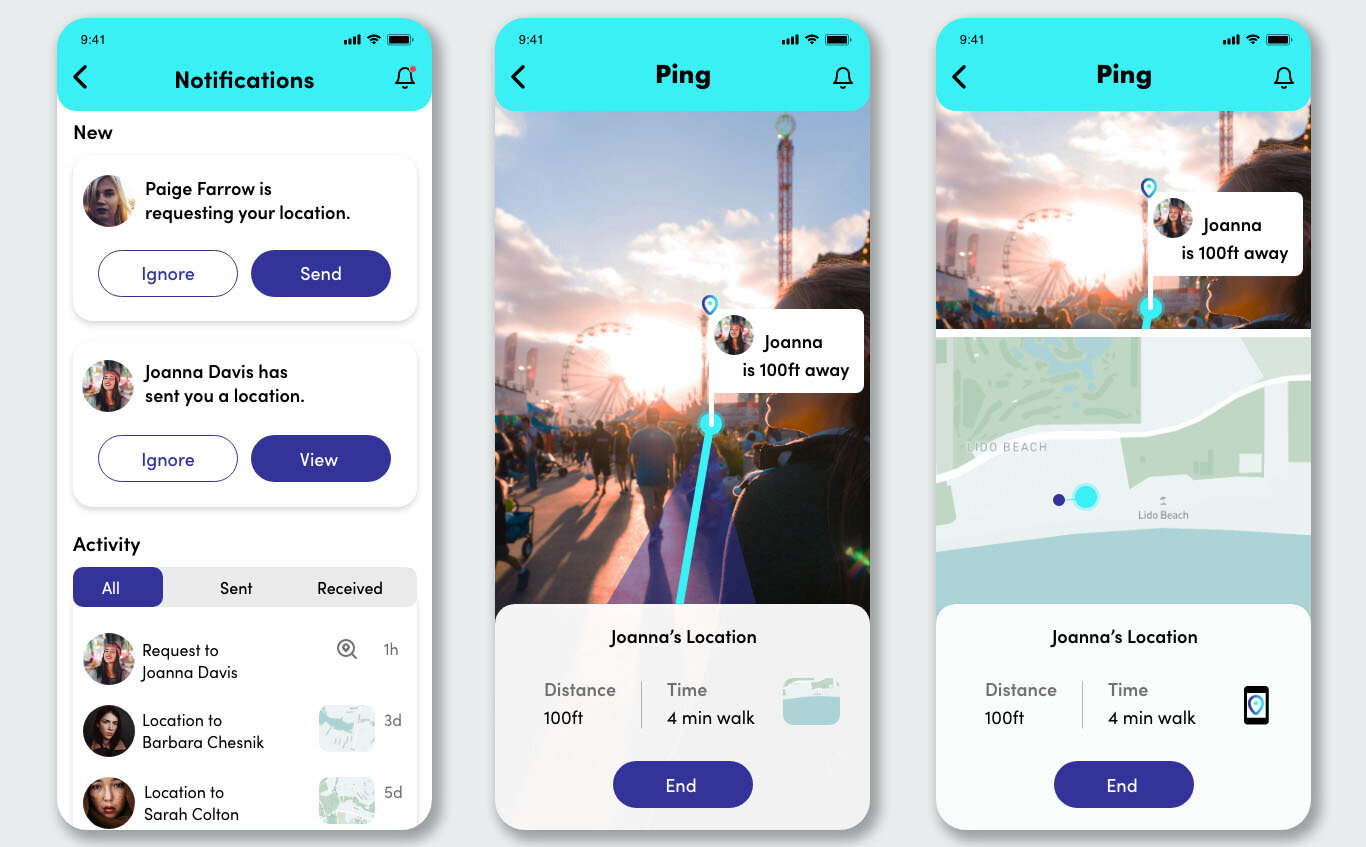
Ping is an app that helps people locate a friend using Augmented Reality in big crowds. It allows the user to have more control of a frustrating situation. Whether at the beach or music festival, you can easily find your friends with Ping.
Roles + Responsibilities
- Lead Ideation and Presentation
- Research and Wireframe UX
- Design HIFI Screens
Scope + Constraints
The constraint was a 6 week timeline and no budget. The assignment was to ideate and design an app. The focus is to help people and make it easier for user.
Context
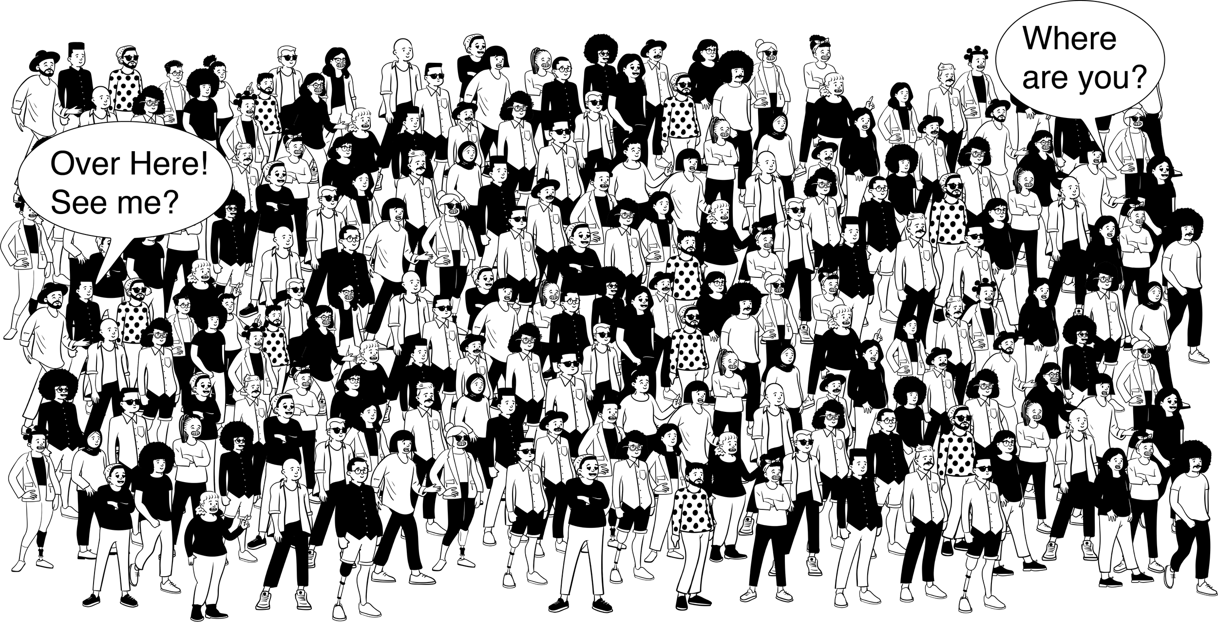
In a crowded open space, like the Color run, people usually go with friends. You go and meet up with friends, but since it’s an open space and you’re unfamiliar with the location, it’s hard to locate them. There are two giant air pineapples and your friend says meet me at the pineapple, but you don’t know which one. You are texting each other and they keep on moving, so you can’t really track where they are, unless you get on the phone and figure out where to meet.
Side note: Color Run, is a where you run/walk and powdered color is thrown at you. In the end you end up looking like a rainbow, and it’s a very fun event.

Problem
People find it hard to find friends in large crowds. People can call each other, but sometimes that isn’t enough if they are in a noisy area or if you keep moving. It’s problematic when you are in an open space and in a huge big crowd, because there’s no way to really pinpoint the location. Users don’t want to be located at all times though. They just want their friend to find them quickly and then the locaters should be off.
Personas
These three personas show the pain points that audiences have and the goals they want to achieve.
Mary Brown
Loves to go out with friends. She’s a social media manager and knows info about events happening in her neighborhood.
“I go to a lot of concerts with friends and sometimes it’s difficult to find them right away when it’s outdoors.”
Pain points: Large open spaces are difficult for big crowds and finding other people.
Goals: Navigate through large open spaces and make it faster.
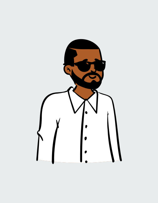
Kevin Pena:
Is a sports marketing agent. Goes to a lot of sport events.
“Meeting up with friends beforehand helps, but sometimes I don’t want to wait for them”
Pain point: Time consuming to wait before entering event.
Goal: Have friends locate him when they are there.
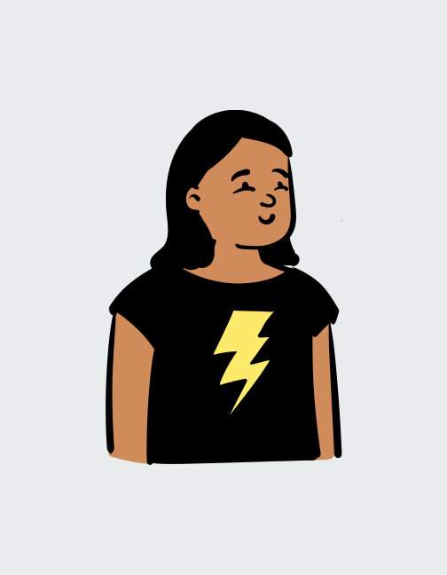
Ana Thomas:
A gamer that loves drones and can’t wait to graduate high school.
“ I use my phone for everything and really like using AR. Sometimes AR is difficult to use though when it’s sunny outside.”
Pain point: Difficult to see what you’re doing if you are outdoors.
Goal: Have a easy to use app that have visible icons.
Research
In this research I surveyed people and asked important questions to better understand the users’ needs.
User + Audience
The age range is a younger audience because they are more likely to use an app that has Augmented Reality.
People ages 16-40
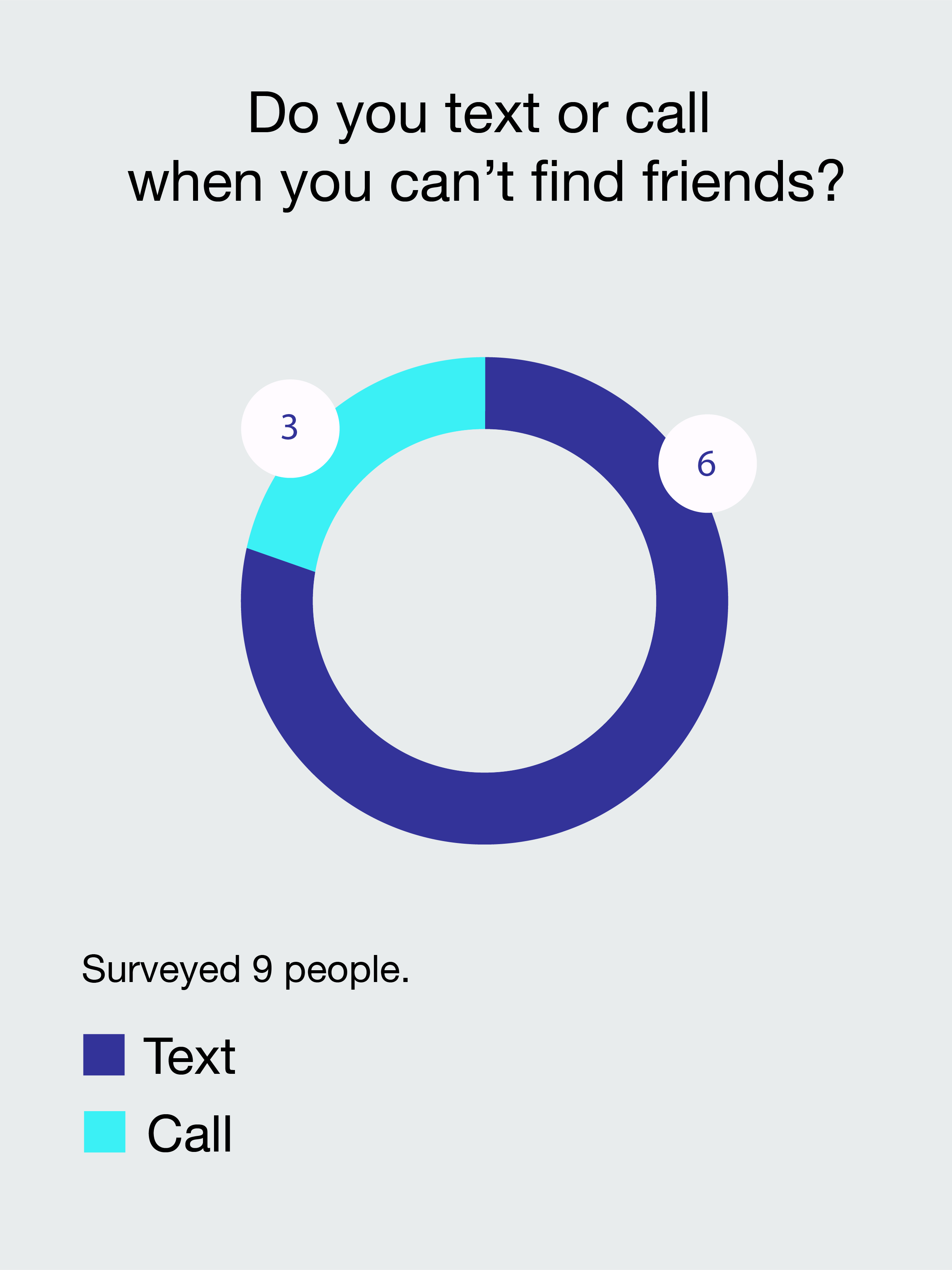
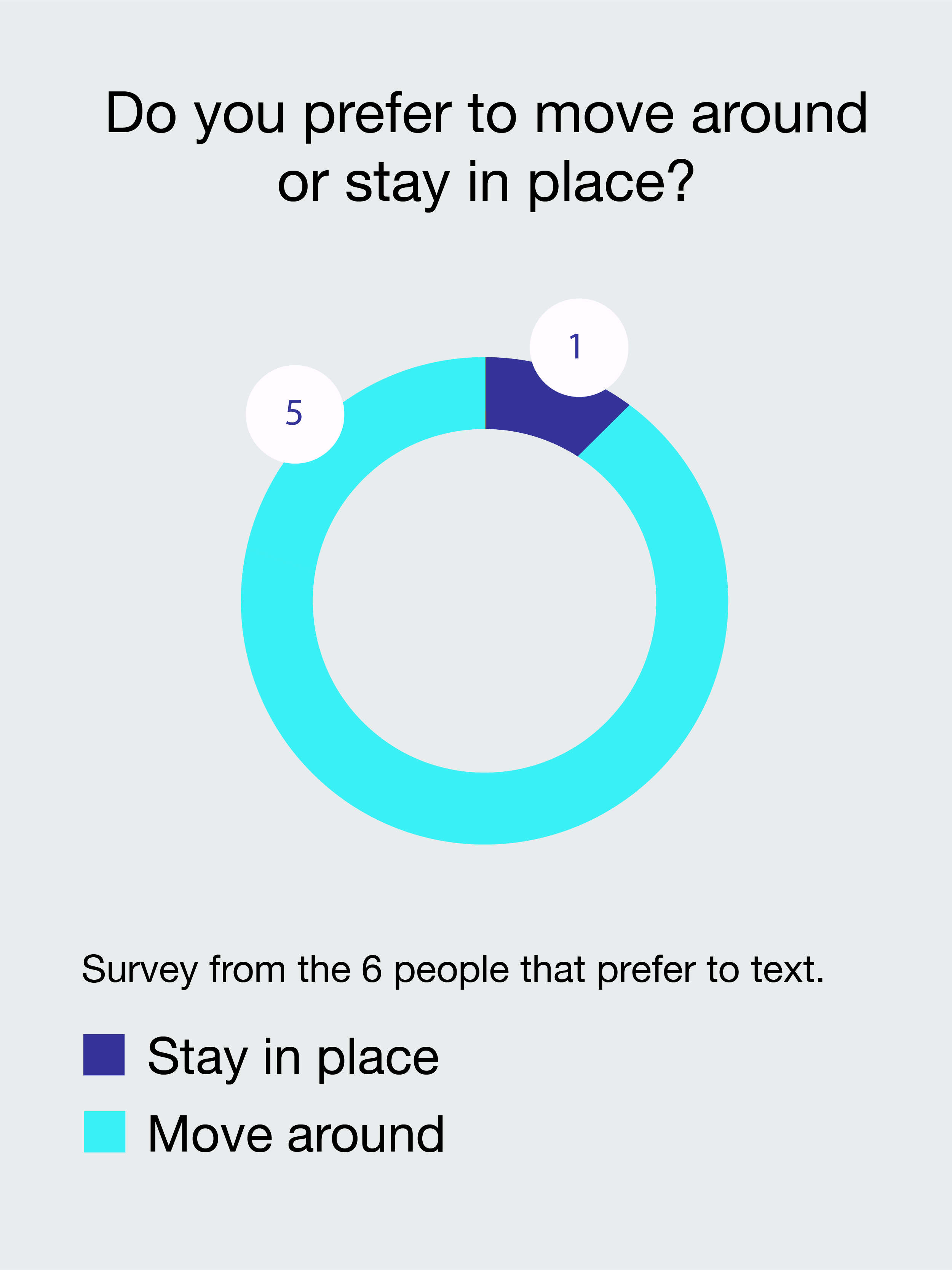
How people communicate
I sat down with nine people and conducted a quick quantitative interview.
Qualitative Research
I sat down with twenty people and conducted a 5 min qualitative interview.
Asked 20 people: Have you used apps that share your location and what problems have you had?
65%
said they don’t like sharing the location all time.
50%
said the main problem is not being able to see exactly where friends are.
Questions I asked myself
How can users communicate with each other?
Do I need a contacts page?
Is AR the best solution?
How can I make this accessible?
What colors are best for screens during sunlight?
What icons are recognizable?
Do users understand that their location is a ping?
User Flows
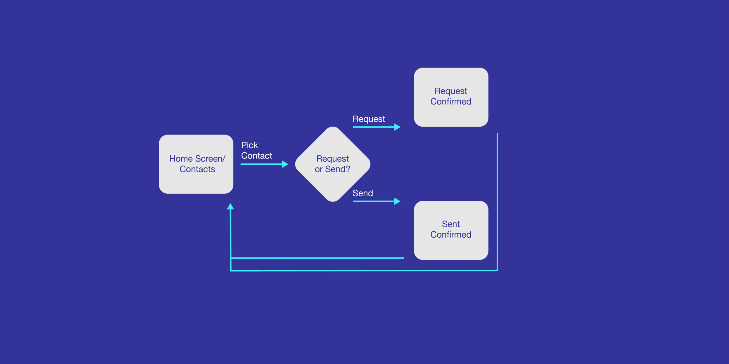
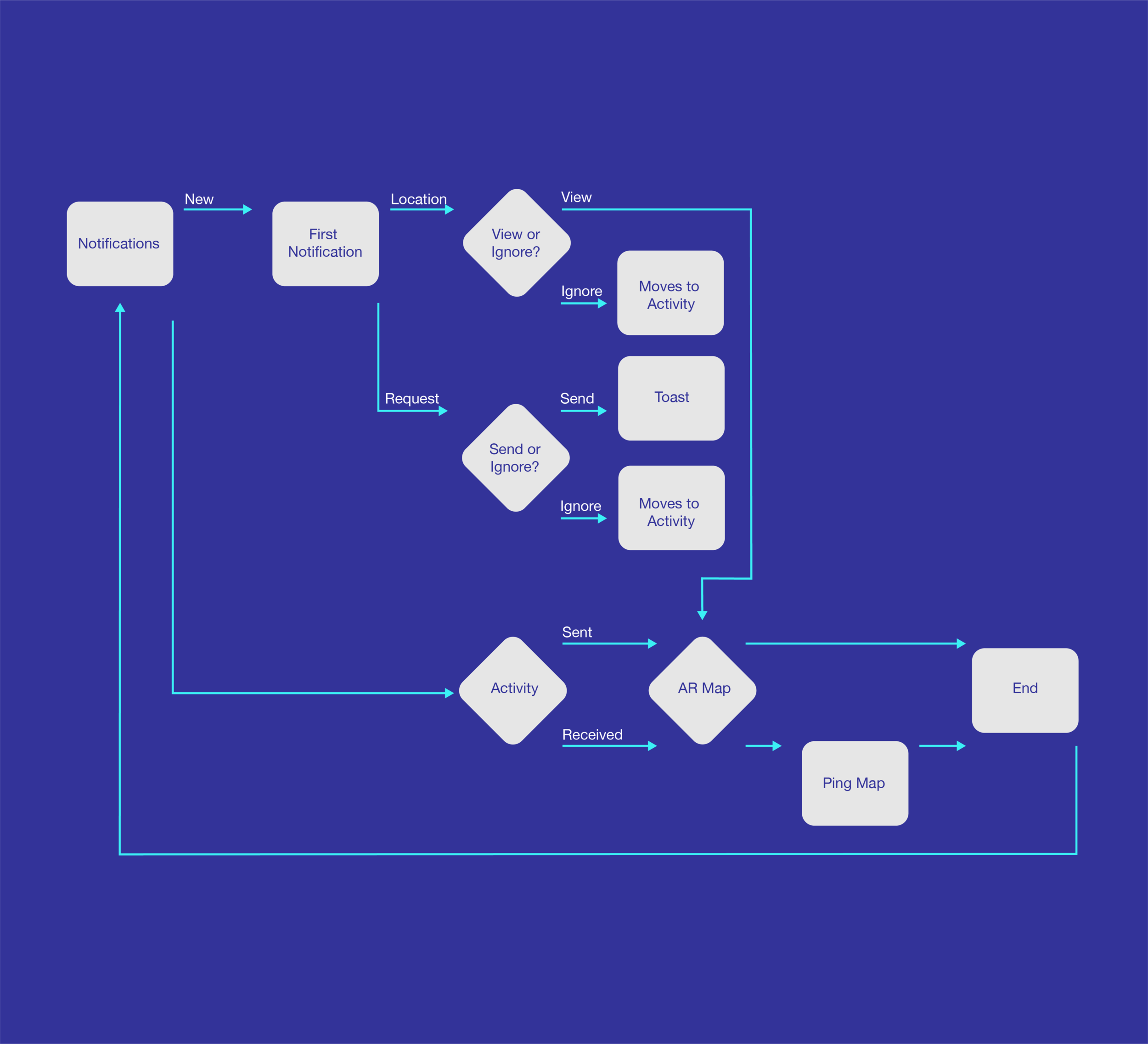
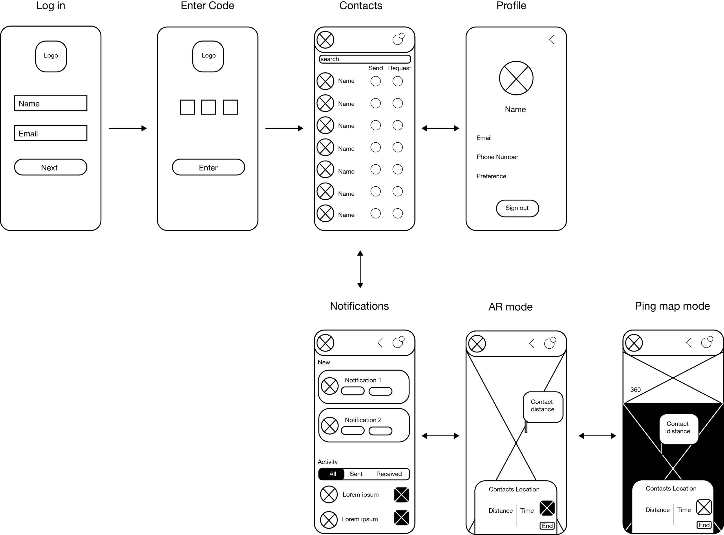
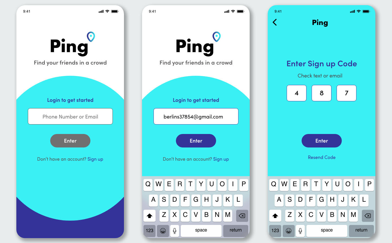
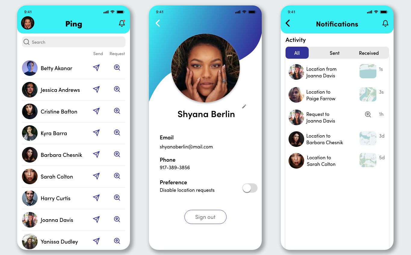
These user flows are showing how to log in and how the user can navigate from the main screen, which is contacts, to seeing things in AR mode.
Log In
Notifications User Flow
Wireframes
Color + Font
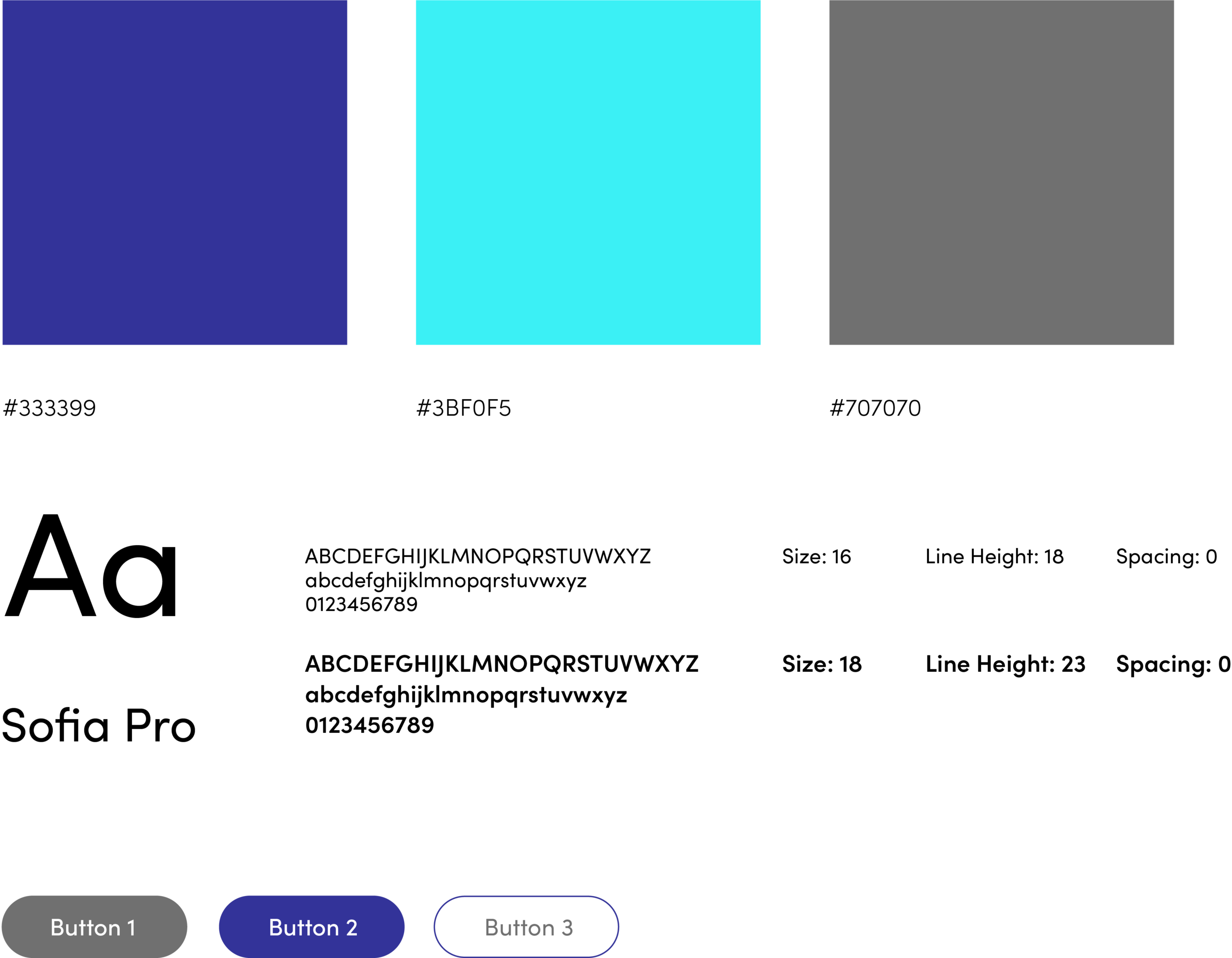
These are the primary colors for Ping. I specifically chose colors that are accessible so that people can see it even in harsh sunlight or low light.
Hifi Design
Conclusion
I’m happy with how the app has evolved. At first, it seemed like it going in a different design direction. With wireframing, the result came out to be better than expected. Going forward this needs to be user tested more. I’ve improved on the UI, but testing will show what else I can add.
